October 12 2021
Census Population Estimates: Something you can count on?

Synopsis: A variety of practitioners use the U.S. Census Bureau’s Population Estimates Program to estimate total state and local population levels between decennial census years. Now that the 2020 Census population counts are out, we look back and ask: how accurate were the estimates? RDN examined county-level data and found that, by and large, the differences between the 2020 Population Estimates and the 2020 Census are impressively small. However, there are some considerable outliers. We discuss possible explanations and provide a map and table for others to explore the data for each US county.
Every ten years the U.S. Census Bureau releases the results of its decennial census, which among many statistics includes the official and most accurate measure of population for each jurisdiction in the United States. These counts have enormous political and economic consequences. They determine the division of Congressional representatives among states as well as the allocation of federal funding for education, infrastructure, housing, and social programs. Unsurprisingly, the release of the census data spurs a host of media coverage and analysis. Often these analyses compare the census counts to another important Census Bureau data series – the Population Estimates. The Census Bureau creates a new “vintage” of estimates each year based on the latest data available. Each vintage include revisions to previous years’ estimates stretching back to the most recent census. Like the census counts, the population estimates are used for a number of important programs, including the allocation of federal funding between census years. They also serve as control totals for statistical surveys and as key inputs for government planners, business analysts, and academic researchers nationwide. Naturally, the accuracy of these estimates is an important and well-studied topic. Each vintage is evaluated by the Census Bureau and demographers seeking to improve the estimation methodology. These analyses are often at the State level, and occasionally in unique local contexts. However, few analyses of the Population Estimates are aimed at a general audience and examining smaller scale variations – hence this post.
We compared the county-level Vintage 2020 Population Evaluation Estimates to the 2020 Census population counts for all US counties. The Population Estimates are usually benchmarked to July 1st of each year, but the Census Bureau publishes the “Evaluation Estimates” series benchmarked to April 1st specifically for comparison to the census counts, which are also benchmarked to April 1st.
Overall, the 2020 Vintage population estimates are quite accurate. Both the estimates and the census counts for 2010-2020 changes have similar distributions (see table low). Formal statistical tests also indicate that their distributions are not significantly different (F-test: F-value=1.0008, p-value=0.98; KS-test: D=0.03, p-value=0.14).
Table 1: Summary Statistics, 2010-2020 Population Changes by County
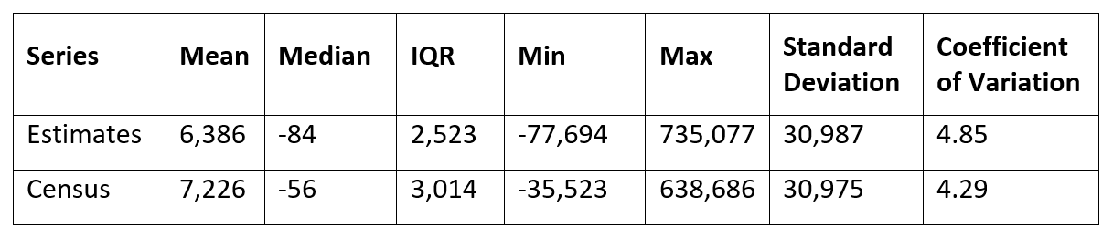
Nonetheless, there are large deviation between the two distributions in the tails, meaning the Vintage population estimates tend to significantly over- and under-estimate the actual population change for the counties that gained or lost the most population over the 2010 to 2020 period. We summarize the error of the estimates in two ways:
- Level differences between the estimated and actual (census) total population change between 2010 and 2020 for each County
- Percentage point differences between the estimated and actual population growth rates between 2010 and 2020 for each County
You may sort and filter US counties based on either measure in Table 2: Population Errors by County. Both measures are useful, but for this analysis we focus on differences in population counts rather than differences in growth rates. Large percentage point errors are important for evaluating statistical accuracy, but the errors in population counts are what ultimately drive changes like the re-allocation of Congressional seats. To illustrate, though the percentage error is the same, an error of 500 people in a county of 50,000 has less of an impact than an error of 50,000 in a county of 5 million. Large errors in percentage point terms are more common for low-population areas. Indeed, the counties with the top ten over-estimated growth rates and top ten under-estimated growth have a combined average population of only 12,684.
Overall, the Population Estimates underestimate the 2010-2020 population change in 1,666 counties and overestimate the change in 1,475 counties (two counties are exactly right). The errors are also closely distributed around zero, indicating they are unbiased. Across all counties, the mean and median error are -839 and -40 people, respectively. Relative to the changes in the 2010 and 2020 census counts, the mean absolute error (MAE) of the change in the 2010 to 2020 population in the Vintage 2020 Population Estimates is 1,965 people. The median absolute deviation (MAD), which is more robust to outliers, is 549 people, and the root mean square error (RMSE), which more heavily penalizes outliers, is 7,926 people. Considering that counties have an average population of 105,456 and a median population of 25,698, these statistics indicate that errors tend to be small. However, the considerable variation in the distribution of errors (SD = 7,883; CV = -9.39) warrants a closer examination.
Figure 1: Distribution of Errors in Vintage 2020 Population Estimates
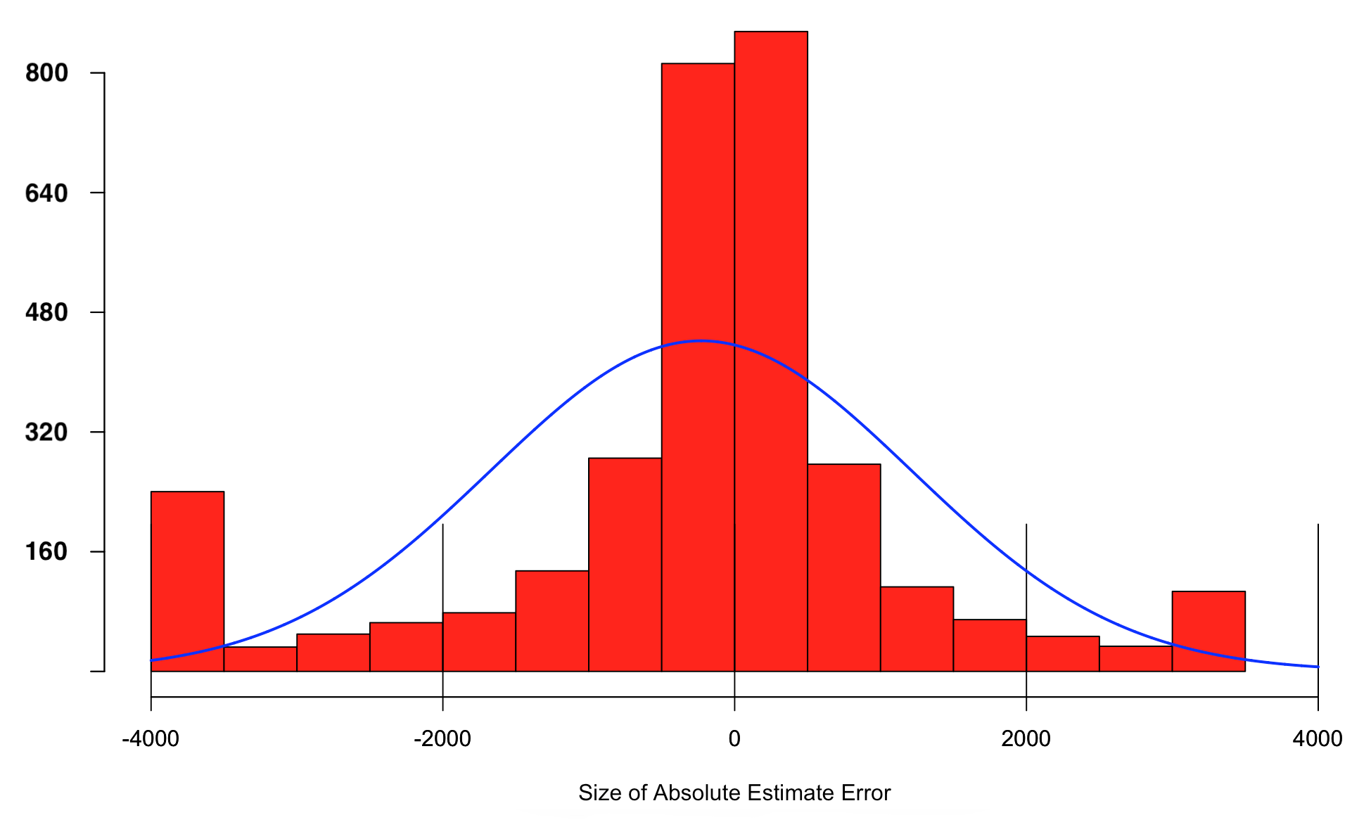
Figure 1 shows the distribution of errors (red bars) in the Vintage 2020 Population Estimates as well as what the error distribution would be expected to look like if it were distributed normally (blue line). We can see the majority of the errors are small; in fact, most are much smaller than one would expect if they were normally distributed. But the number of extreme outliers is also larger than one would expect under a normal distribution. If we apply a cut-off of [(Q1÷Q3) ± (IQR*1.5)] for outliers, and [(Q1÷Q3) ± (IQR*3)] for strong outliers, we find that 200 of the overestimated counties are outliers, 93 of them strong outliers, and 371 of the underestimated counties are outliers, 236 of them strong outliers. The tendency towards underestimating populations is reflected in the right skew statistic of -10.51. The most extreme error on either side of the distribution are an undercounting of 194,370 people in Kings County, NY and an overcounting of 131,626 people in Maricopa County, AZ.
What might explain these outliers? We will look at four examples—two of the top ten overestimated counties and two of the top ten underestimated counties—and examine some key factors that may explain the large deviations between the Population Estimates and the Census counts.
Population trends are largely explained by a combination of demographic, social, economic, and political factors. The interactive map (Figure 2) and table (Table 2) at the end of this post illustrate that most of the counties where the 2020 population was significantly underestimated are in the Northeast, namely New York and New Jersey. There is also significant undercounting in Cook County, IL, i.e., Chicago. A larger than expected growth for the metro areas of New York City and Chicago is in line with a general resurgence of large cities throughout the 2010s. Partially this can be explained by their position as large economic centers, as well as ongoing demographic shifts. Millennials are now the largest generation in the US, having outnumbered Baby Boomers since 2019. The next generation, Generation Z, is on track to be the best educated and most diverse generation. Younger and educated people at the beginning of their careers tend to gravitate towards cities for economic opportunity and more cosmopolitan experiences. Cities with large minority populations also tend to grow faster than cities with smaller minority populations. Hispanics were set to become the largest minority group in the US electorate in 2020, and incidentally Kings County and Queens County in New York, Essex County in New Jersey, and Cook County in Illinois all have relatively large Hispanic populations. Thus, one reason for the large errors in these areas is because the Population Estimates underestimated the growth rates for these minority populations.
Figure 2: Map of Errors in Vintage 2020 Population Estimates Based on 2010-2020 Total Population Change, By County
Another reason for errors in the Population Estimates is the COVID-19 pandemic. Remote work policies may have caused certain populations like college students to be counted as living in their home county rather than in their institution’s county. It is also worth noting that New York City substantially increased their outreach for the 2020 census, including adding many more housing units to the Census Bureau’s outreach list, which facilitated more accurate and encompassing counts. The population of Suffolk County, NY was also undercounted, though for different reasons. Notable for the Hamptons and other Long Island getaways, Suffolk County may have attracted significant populations of remote workers during the pandemic, who then established residency during the 2020 Census.
It should be noted that even for the largest discrepancies between the Population Estimates and the 2020 Census, the Estimates almost always matched the direction of population change (see Table 2). The exceptions are Cook County, IL and Suffolk County, NY, where the Population Estimates expected a population decline in 2020 relative to 2010, but the 2020 Census counts showed that their populations increased.
There are likely different reasons for counties where the Population Estimates overcounted the 2010-2020 growth relative to the 2020 Census. These counties tend to be clustered in southern Arizona, as well as some in Nevada, California, Florida, and Texas. All the counties in this area with overestimates experienced population growth, just at a lower level than expected. Some believe these cases stem from undercounting in the 2020 Census. Such undercounting could be due to the pandemic and the composition of the population. The counties in this region with significant overcounts all have large Hispanic populations, and according to an Associated Press report, the share of Hispanic and Black populations in these areas was lower than expected. Reasons for this might be a sharp decrease in unauthorized immigrants over the past few years who tend to make up a higher-than-average portion of the population in California, Texas, Arizona, Florida and Nevada, along with a decrease in births to unauthorized immigrants. Factors such as news about the controversial citizenship question on the Census (which ultimately was not added), language barriers, and an increase in immigration enforcement actions near the border, may have all reduced minorities’ participation in the 2020 Census, leading to undercounting in these counties. Additionally, such developments might have spurred increased migration to New York and Illinois, which are two other states with large immigrant populations. Notably the 2020 Census for New York and Illinois showed their populations had increased much more than expected per the Vintage 2020 Population Estimates. Many individuals in these south-western counties also rely on P.O. Boxes for mail, which may have made it difficult for the Census Bureau to maintain accurate lists of housing units. It should also be noted that the errors for the top ten overestimated population changes by county (mean = 41,250) are notably smaller than the top ten underestimated population changes by county (m = ‑95,199).
Overall, the Vintage 2020 population estimates are quite accurate and reliable. Nonetheless, they contain some significant errors, which are concentrated in the counties with the largest changes in population. These errors stem from a variety of factors that are difficult to compensate or model. Such factors include population flows, which is notoriously hard to predict, as well as unforeseen events, like the pandemics. Alternatively, it is possible that inaccurate estimates stem from over- and under-counting in the 2010 Census, which was used as the base for the 2010-2020 Vintages of Population Estimates. For the counties that comprise New York City, for example, hundreds of thousands of existing housing units were only recently reported to the Census Bureau.
Please use the map (Figure 2) and table (Table 2) below to explore the differences between the Vintage 2020 Population Estimates and the 2020 Census counts.
Table 2: Errors by County, Vintage 2020 Population Estimates